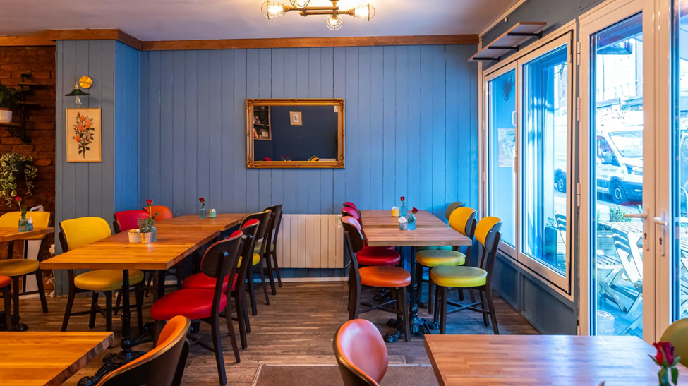
First step into this restaurant
When you first step into this restaurant, you can’t help but sigh: “Ah, so charming!” Earthy tones, cozy chairs, lush plants gently flirting with the sunlight. It’s the kind of place that should be thriving. Yet, under the pretty surface, tiny behavioral design mistakes are quietly leaking profit by the minute. Let’s dive into the hidden psychology — and how to fix it.
Flatline Syndrome: Where’s the Adventure?
All tables, all chairs. Same height. Same perspective. It’s like attending a dinner party where everyone whispers in monotone.
- Behavioral Principle: Environmental Variety Principle (Mehrabian & Russell, 1974)
- Why It Matters: Your brain craves sensory stimulation. Environments without height variation feel… dead. Guests unconsciously “bore out” faster, cutting visits short.
Quick Win: Add a few high tables, sleek bar stools, or a cozy bench corner with raised cushions. Let the eye travel! Longer stays = more desserts, more wine, more smiles (and higher bills).
Missing: A Hero Element
Your brain desperately wants a “main character” when it walks into a space. Here? It gets a lovely shrug.
- Behavioral Principle: Visual Anchor Theory
- Why It Matters: Without a visual anchor (a bold light fixture, a dramatic art piece, a signature table), guests experience mild spatial confusion. It feels unfinished — like a novel missing its last chapter.
- Quick Win: Install one show-stopping hero. Think: an oversized floral installation. A mesmerizing custom chandelier. Something your guests Instagram before they even sit down.
Tables are Naked (and Not in a Good Way)
The tables are bare — clinically so. No flowers. No candles. No menus inviting a little “curiosity dance.”
- Behavioral Principle: Priming Effect (Bargh et al., 1996)
- Why It Matters: Tiny sensory cues (a flickering candle, a soft-petaled flower, a tempting menu insert) prime the brain for comfort and indulgence. No cues = less emotional warmth = smaller orders.
- Quick Win: Mini vases, seasonal menu cards, or warm candlelight. Give guests something tactile, something charming to engage with while they wait. Watch your average check size grow without raising prices.
Color Clash: Red vs. Green — The Silent Battle
The color scheme is caught in a “civil war.” Reds and greens thrown together without pattern. It’s confusing, slightly stressful, and makes the space feel noisier than it is.
- Behavioral Principle: Color Conflict Theory
- Why It Matters: Random color placement creates “visual dissonance,” triggering low-level anxiety and clutter perception.
- Quick Win: Zone your colors. Red chairs for two-tops. Green chairs for group tables. Organized color = organized mind = guests linger longer and feel more upscale.
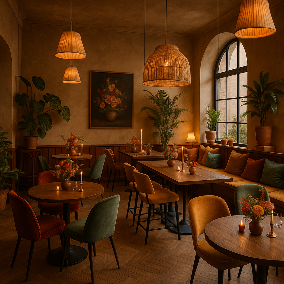
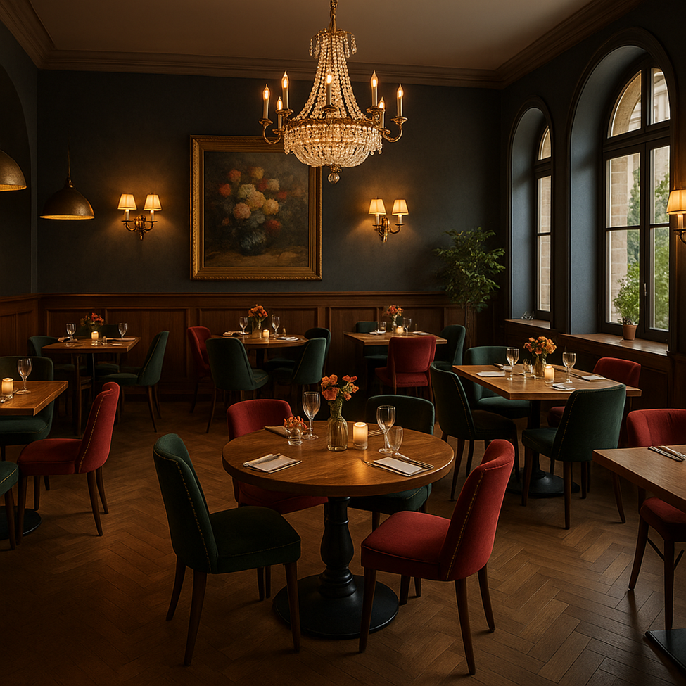
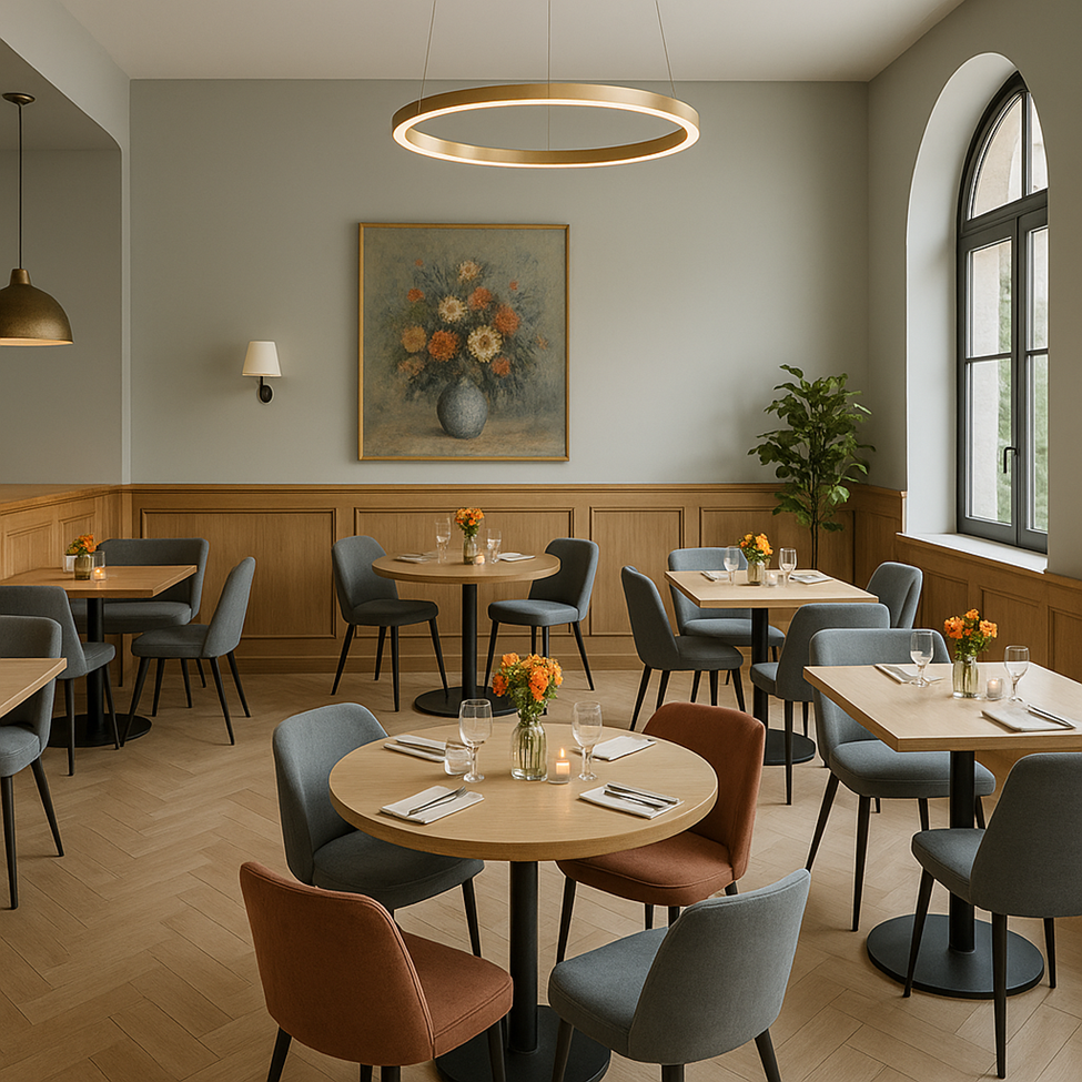
Imagine this space with 3 different design styles
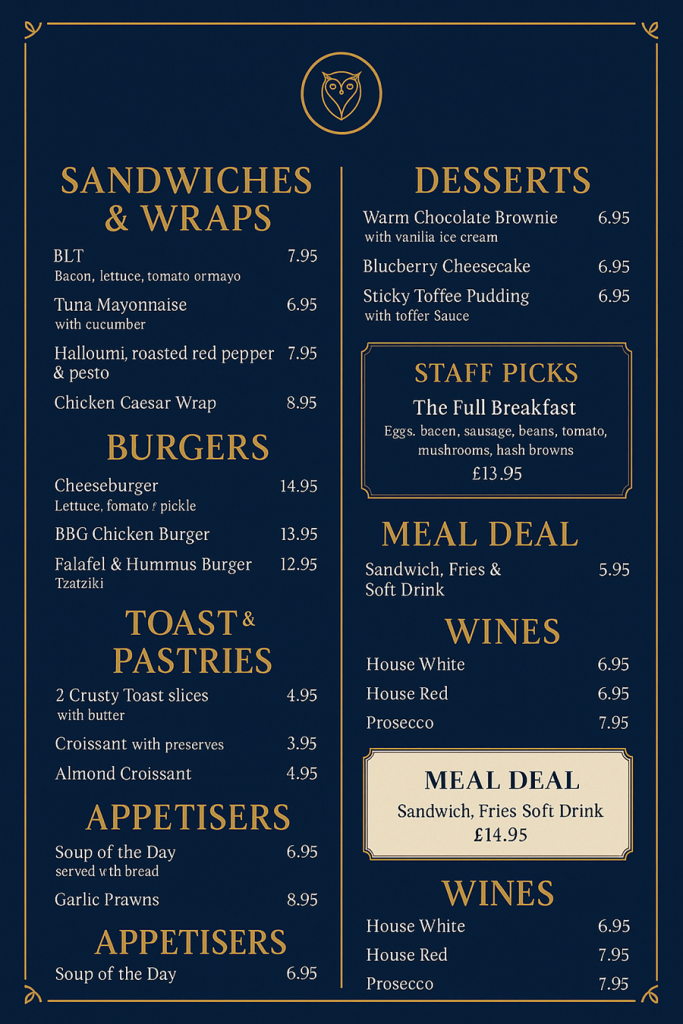
Visual Design Problems
1. Eye Flow Violation
- Problem: Column layout forces the eye to jump, making reading uncomfortable.
- Theory: Cognitive Fluency Theory
- Quick Fix: Differentiate columns with subtle backgrounds or separators to guide the eye smoothly.
2. Weak Visual Hierarchy
- Problem: Section titles and item names look too similar.
- Theory: Visual Hierarchy Theory
- Quick Fix: Make section titles bolder, larger, or in different colors for faster brain mapping.
3. Poor White Space Usage
- Problem: Items are cramped together, creating a crowded feeling.
- Theory: Gestalt Principles
- Quick Fix: Add more breathing room (1.5–2x font height) between groups and items.
Pricing Psychology Problems
4. Rounded Pricing Mistake
- Problem: Prices end in .50 or whole numbers, missing the psychological advantage.
- Theory: Charm Pricing Effect
- Quick Fix: Use .95 or .99 endings (£12.95 vs. £12.50) to make prices feel lower.
5. No Strategic Decoy
- Problem: No expensive item anchors to make other options feel more reasonable.
- Theory: Decoy Pricing Strategy
- Quick Fix: Add one or two “luxury” priced items to guide customer choices.
6. No Bundle Offer
- Problem: Items sold separately without combo incentives.
- Theory: Bundling Effect
- Quick Fix: Offer small combos (e.g., Sandwich + Coffee £14.50) to boost perceived value.
7. No Highlight for High-Margin Items
- Problem: Profitable items like desserts or wines aren’t visually emphasized.
- Theory: Salience Theory
- Quick Fix: Highlight these with frames, icons, or subtle color pops.
In Conclusion: A Stunning Space One Nudge Away from Greatness
This restaurant has the bones of a bestseller. But without strategic behavioral design, even the prettiest spaces silently underperform. With a few smart tweaks — some height play, a visual anchor, sensory cues, color zoning, better pricing psychology, and visual flow — this charming spot could effortlessly double its emotional magnetism (and its profit).
Imagine:
- 15% longer dwell times
- 10% higher average check
- 20% boost in Instagram-worthy moments
All from small, psychology-backed adjustments.
These are just my two cents — you can totally disagree… but hey, your guests’ brains might not.
Comments are closed