When a Restaurant Tries So Hard, the Brain Taps Out
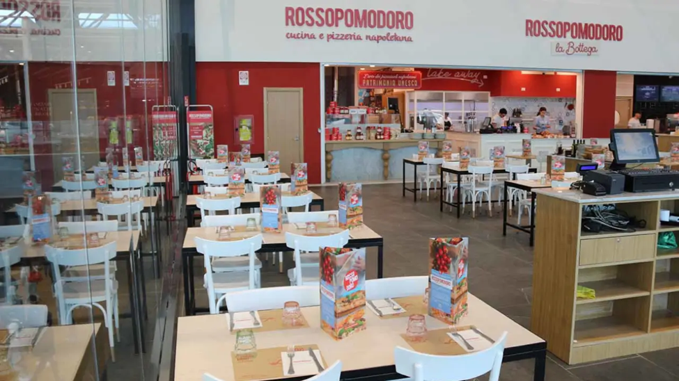
You walk in. Everything is branded. Everything is red.
And every table? A carbon copy of the last.
It’s the kind of space that shouts “We’re ready for you!” — but not in a calm, “welcome in” way.
More like… a high-pressure sales pitch from the pasta section.
Let’s explore how a few smart behavioral upgrades could turn this space from “fast turnover” to “fast favorite.”
Visual Overload: The Menu Mayhem Effect
Identical upright menus on every single table. No spacing. No variety.
This overloads the brain via Repetition Blindness and Decision Fatigue.
When everything looks the same, the brain checks out — and appetite doesn’t stand a chance.
Fix it (Smart Branding):
Rotate 2–3 visual menu designs
Diagonal placement over mirrored symmetry
1 menu per small table = enough
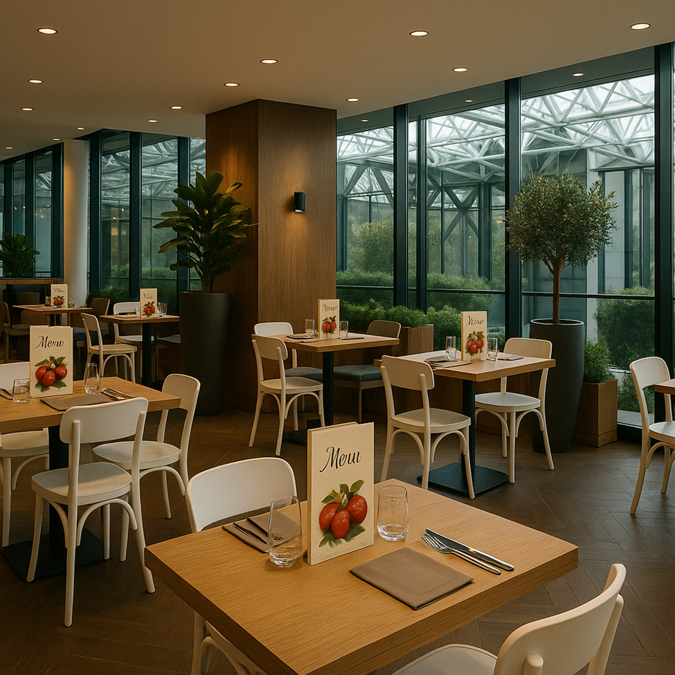
Red Walls + Harsh White Lights = Brain Stress
Red boosts appetite… in theory.
But pair it with bright, cold commercial lighting and suddenly you’re running a lab, not a restaurant.
The brain shifts from “mmm” to “move fast.” Not ideal.
Fix it (Low-Cost Solution):
Add amber-tone bulbs (3500K or lower)
Create lighting zones for dine-in vs takeaway
Introduce natural elements like wood or greenery to balance intensity
Where Am I Supposed to Go?
No visual boundaries between ordering, waiting, and dining.
Your guest’s brain doesn’t know what mode it should be in — and that ambiguity triggers discomfort.
Fix it (Behavioral Zoning):
Add plant partitions or soft dividers
Change the flooring material or tone between zones
Use subtle signage or “flow cues” to help the brain navigate
Overbranded, Under designed: The Display Wall Dilemma
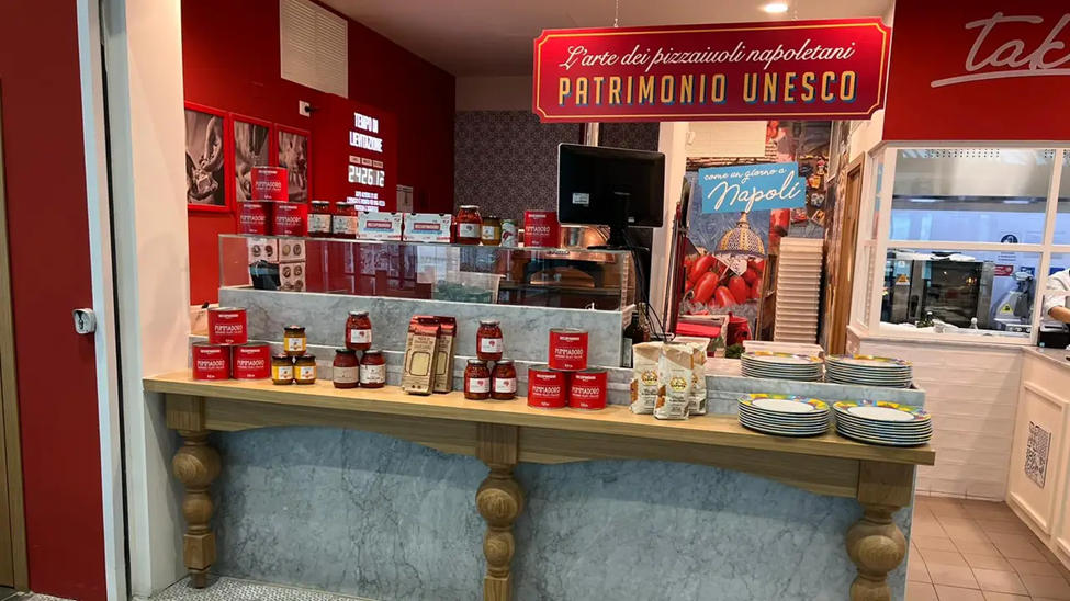
That gorgeous wall of jars, cans, and pasta could be a hero moment.
Instead? It’s cluttered.
Products crammed edge-to-edge with no breathing room kills Processing Fluency.
Also: the digital screen facing staff only? Big missed opportunity.
Fix it (Retail Brain Upgrade):
12cm spacing between featured products
Tiered or asymmetrical product placement
Reorient the screen to face customers with a subtle motion or promo cue
Airport Edition: Where Signage Eats the Experience
In transit-heavy locations, signage is everywhere.
That giant yellow wayfinding board directly above the dining space? It hijacks attention.
Your guests aren’t eating. They’re scanning.
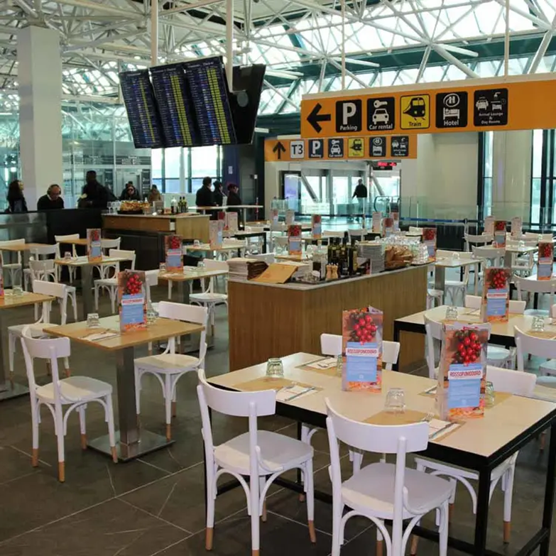
Fix it (Cognitive Relief):
Use seating layouts that block direct sightlines to alert signage
Create calm focal points with a low-light table design
Blur external visual noise with semi-opaque dividers
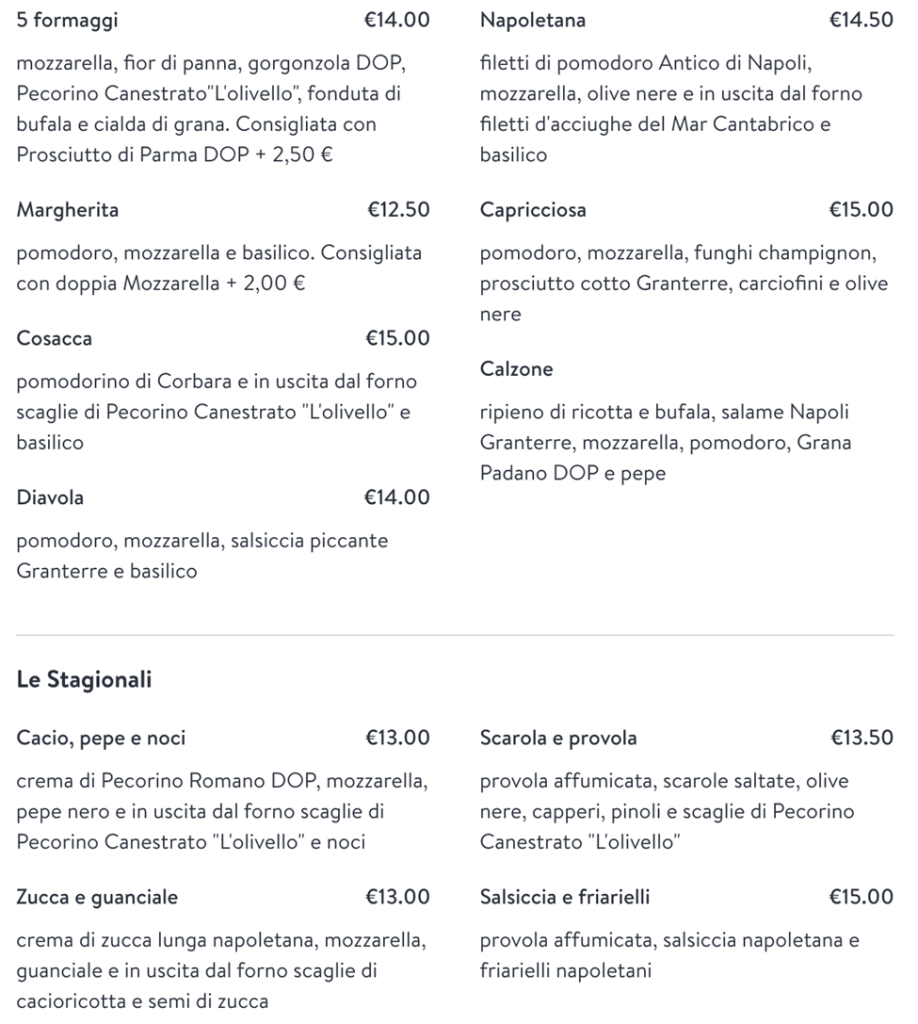
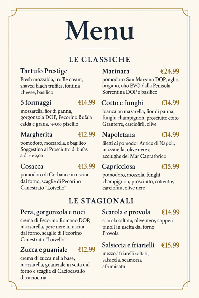
The Menu That Misses the Mind
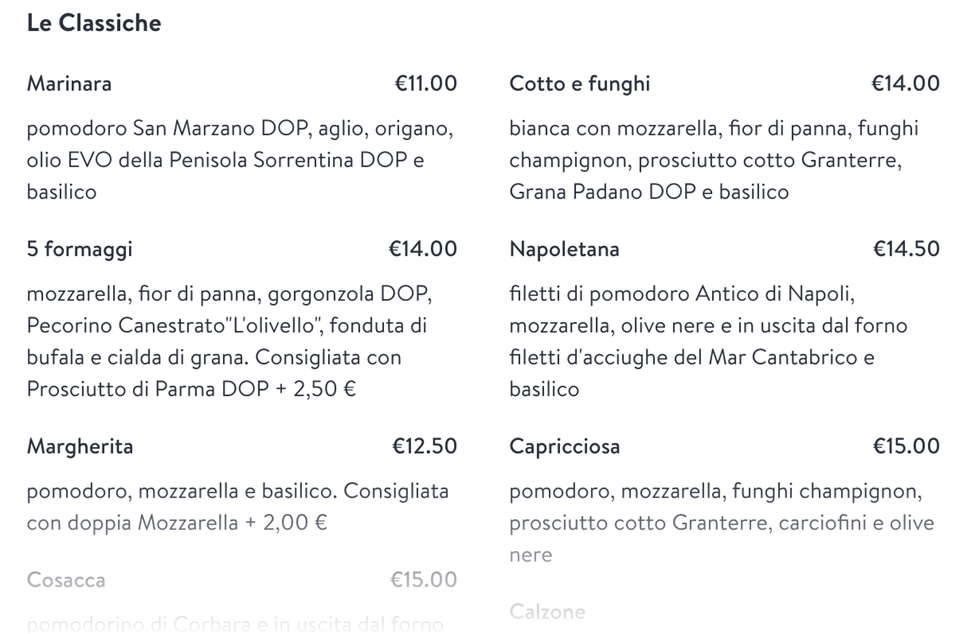
From the font to the pricing, this menu looks neat. But that’s the problem. It’s too perfect, too flat, and too cognitively heavy.
Here’s where it falls short (and how your brain knows it):
Insight 1: Round Numbers, Rounded Profits
Every price ends in €0.00 — clean, but deadly.
According to the Left-Digit Effect, €14.00 feels psychologically more expensive than €13.90. That tiny “.90” creates a cognitive trick: it pushes the price into the previous category in your brain.
Fix it: Shift prices to €X.90 — it maintains class while triggering better value perception.
Study: Wertenbroch & Skiera (2002) showed that left-digit pricing increased purchase intent by 8–12% in menu environments.
Insight 2: No Price Anchor = No Sales Boost
With all prices hovering around €13–15, nothing feels “worth it” or “special.”
According to the Anchoring Effect, one visibly premium item (€19–€21) can make the €14 pizza feel like a smart deal — instead of just an average choice.
Fix it: Add a high-priced “chef’s creation” or “limited edition” pizza. People rarely choose it, but it makes everything else seem more affordable.
Real-world example: Wine lists with one $200 bottle boost sales of $60 wines. Why? The $60 becomes the “safe premium.”
Insight 3: Gourmet Words ≠ Gourmet Decisions
Words like “Pecorino Canestrato L’Olivello” or “Grana Padano DOP” are accurate — but heavy.
This is a Cognitive Fluency issue: the harder something is to process, the less likely we are to choose it.
Fix it: Add a tiny description or image next to specialty items. Even “aged sheep’s cheese with bold flavor” helps the brain relax and feel informed.
Real-world case: Starbucks saw an 11% increase in specialty drink sales after changing names from “Triple Roast Extra Bold” to “Dark Rich Roast.”
Same drink. Different psychology
Visual Design Breakdown
Insight: One Font, One Mood, No Hierarchy
Everything in the same size, weight, and color. This breaks Visual Hierarchy and Attentional Guidance — the brain can’t tell what’s important.
Fix it:
- Pizza name = bold, 16–18px
- Ingredients = lighter font, smaller, 12–13px
- Price = right-aligned, slightly tinted (e.g., dark green) for scanning
Insight: Linear Layout = Cognitive Fatigue
No separation between categories, no grouping. This overloads working memory. According to Chunking Theory, we can’t process more than ~7 things unless they’re grouped.
Fix it: Use subtle boxes, icons, or background shading to group “Classiche”, “Stagionali”, etc. A tiny icon or soft pastel box can do wonders.
Bonus tip: People spend 30% more time looking at menus that feel “organized” vs. “uniform” (Eye-tracking study, 2018, Cornell Hospitality Research).
Final Slice
This menu isn’t bad. It’s just not behaviorally fluent.
You’re making the guest do all the cognitive lifting — and when brains are tired, they go safe, cheap, or fast.
Want more premium orders? Higher check size? More confident guests?
Let’s redesign your menu for the brain — not just the brand.
→ Ready for a menu makeover? Let’s talk.Results may vary. Brains are weird. Use responsibly.
No responses yet