We’re in Lisbon this week, exploring a restaurant that feels like it tried really hard to impress… but ended up sending mixed messages to the brain. While the space has a clean look and there’s visible effort, something about it just doesn’t click emotionally. And in behavioral design, that click is everything.
Let’s walk through what went wrong – behaviorally, psychologically, and oh yes, neurologically – starting with the menu.
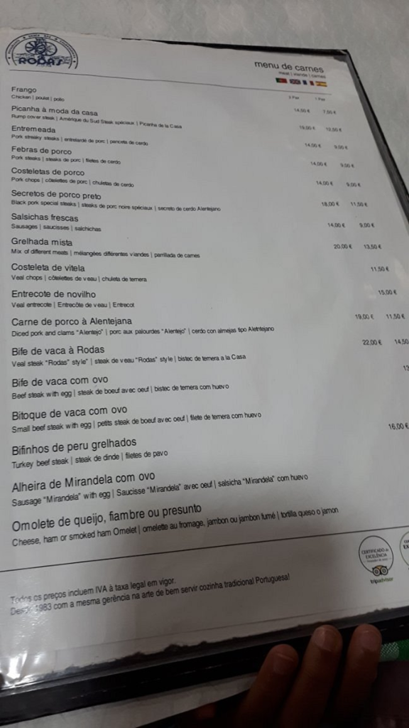
Menu Mayhem
1. Rounded Prices Only (€15.00, €13.00)
Let’s first talk about the theory behind this: Charm Pricing Effect. This is the psychological principle that prices ending in .95 or .99 are perceived as significantly cheaper than their rounded counterparts. Why? Because our brains read from left to right. €12.95 feels closer to €12 than €13.00 does, even if it’s just a 5-cent difference.
Real-World Example: McDonald’s has long used prices like €4.99 or €1.95 for this exact reason. It encourages impulse decisions and makes people feel like they’re getting a deal.
2. No Visual Highlights for Specials or Profitable Items
Let’s introduce Salience Bias. This theory says our brains latch onto what visually stands out. If your menu looks like a sea of identical fonts and layouts, there’s no anchor for the guest’s attention.
Real-World Example: Starbucks highlights seasonal drinks or bestsellers with boxes, colors, or icons — guiding your eyes to where the profit lives.
3. Crammed Multilingual Translations
Here, we meet the infamous Cognitive Load Theory. When you list “Chicken | Poulet | Pollo” on every line, the brain must parse multiple options simultaneously. This overload makes decision-making harder — and sometimes leads to no decision at all.
Real-World Example: IKEA learned to separate product names and descriptions clearly in multilingual markets, reducing visual strain and boosting conversions.
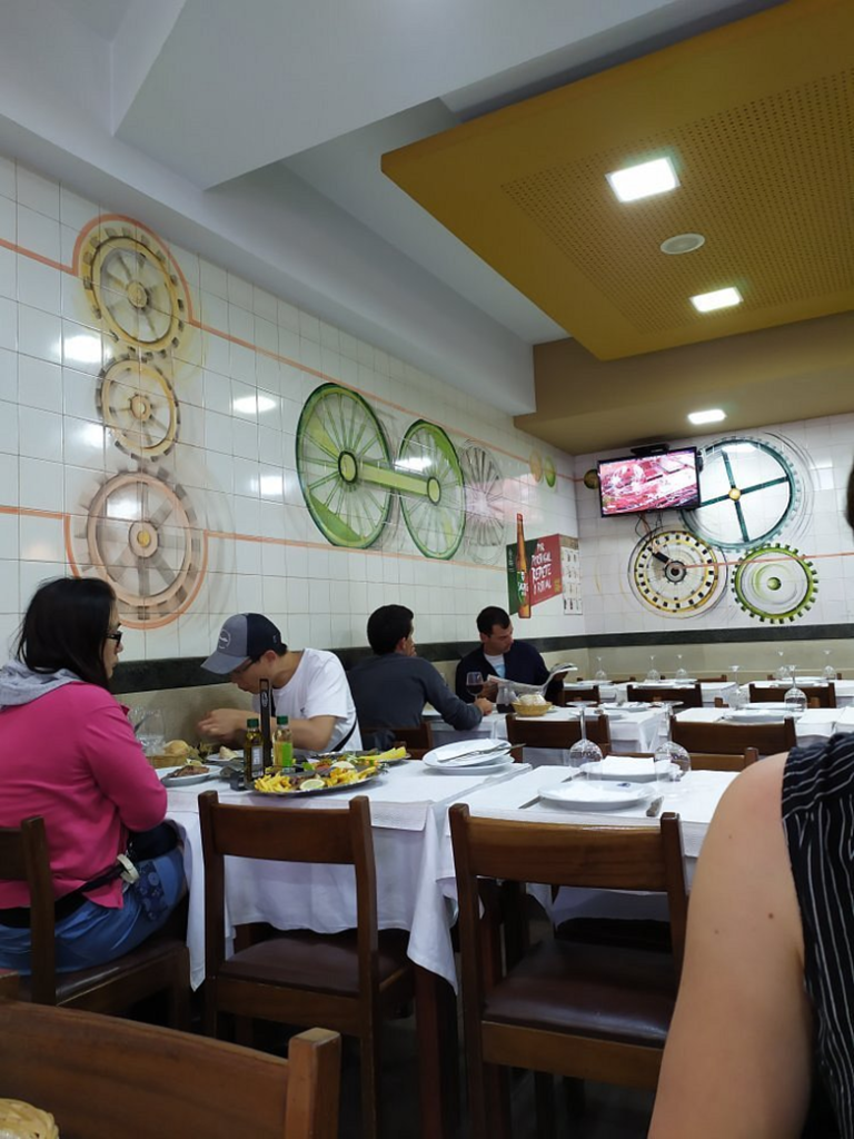
Decor Drama
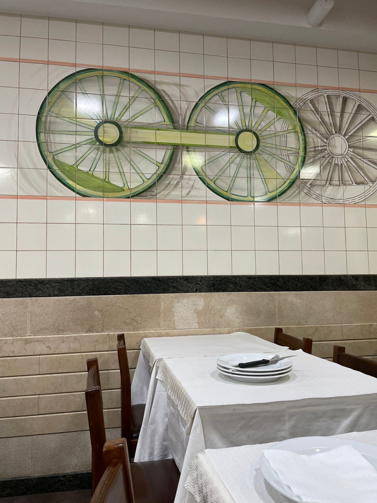
1. A Wall of Industrial Gears?
Time to unpack Schema Congruity Theory. This principle states that environments should match the mental expectations of their function. When guests see mechanical wall art in a restaurant, their brains say “factory” or “garage” – not “delicious food.”
Real-World Example: Chipotle’s early “industrial chic” look worked only because the brand built an entire food philosophy around it. Without that alignment, gears just look out of place.
2. Emotionally Empty Tables
This is where Priming Effect enters. A flower, a candle, a seasonal card — they all prime the guest’s brain for warmth, value, and care. A bare table? That primes nothing except “meh.”
Real-World Example: Nobu restaurants use a single branded stone, flower, or scent element on tables. This one subtle cue increases emotional connection — and even tip size.
3. Chairs Crammed Into Tables
Let’s talk Proxemics and Approachability. Humans need personal space, even subconsciously. When there’s no physical gap between chair and table, the brain feels blocked or “uninvited.” This delay — even by 3 seconds — can reduce dwell time.
Real-World Example: High-end cafes like Blue Bottle use slightly pulled-out chairs to silently invite guests to sit. It’s a physical hello.
Lighting & Layou
Etdowns
1. Cold Overhead Lighting on Glossy Tiles
Enter Color Temperature & Emotional Response. White fluorescent light might look clean, but emotionally it drains warmth and social energy. Combine that with shiny white tiles? The space reads “clinical” instead of “cozy.”
Real-World Example: Most boutique restaurants invest in dimmable warm lighting to encourage relaxation and longer stays — which means more courses, more drinks, and more profit.
2. Distracting TV Above Guests
Here comes Attentional Capture. Moving images naturally draw attention. A TV on the wall hijacks focus away from conversation, menu, and ambiance.
Real-World Example: Some cafés (like Pret a Manger) ban TVs to promote mindfulness and social connection. It’s intentional — and it works.
3. Glossy Tiles from Floor to Ceiling
Let’s talk Environmental Fluency & Tactile Warmth. When everything is white, glossy, and sterile-looking, the brain has no visual break or softness. It feels unfinished, or worse — like a cafeteria.
Real-World Example: Ottolenghi’s delis balance glossy white with natural wood, plants, and color splashes to keep the space human and warm.
Kitchen Counter Chaos
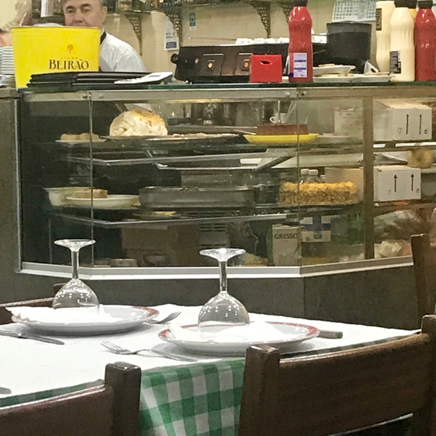
1. Visible Mess (Even if It’s Clean)
This taps into Visual Hygiene Heuristic. When guests see raw food, clutter, or plastic packaging — even in order — it triggers subconscious distrust. Cleanliness isn’t the same as perceived hygiene.
Real-World Example: Open-kitchen restaurants like Din Tai Fung maintain surgical clarity — no visible clutter, no guessing games.
2. Big Red Bottles in Plain Sight
Let’s revisit Color Dominance. Red is powerful, but overwhelming when it lacks purpose. A giant red ketchup bottle in the middle of a sleek space? That’s a branding mood swing.
Real-World Example: Heinz redesigned their in-restaurant bottles to be more subtle and brand-aligned, especially in upscale locations.
3. Picnic-Style Tablecloths + Fancy Glassware
Cue Incongruity-Induced Discomfort. The brain loves coherence. Gingham tablecloths and stemmed wine glasses? That combo confuses expectations. Is this casual? Formal? Retro?
Real-World Example: Upscale burger joints like Shake Shack lean into their identity fully — sleek trays, minimal tablecloths, clear visual tone.
In Conclusion: Design Isn’t a PowerPoint Slide — It’s an Experience
This restaurant doesn’t lack heart — it just lacks alignment. And in the psychology of space, alignment is everything. When visuals and behavior clash, the brain disconnects. The guest smiles politely. And dessert? Skipped.
Everything you just read? It’s just how my behavioral brain interpreted the cues. No pressure to agree — but your guests’ reactions will speak louder than mine.
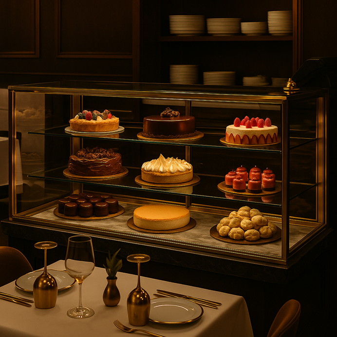
And the photos? They’re approximations — not the real deal. But the brain science? That’s 100% cooked and served fresh.
Next time, let’s maybe keep the TV off, the ketchup subtle, and give those chairs a little breathing room, shall we? 😉
Comments are closed