Before a guest even picks up their fork, their brain is already running a full psychological scan of what they see. Sometimes, a restaurant can get so many visual, spatial, and menu cues almost right—but miss just enough that the entire experience feels… flat. This case is one of those.
We’re talking about a place that looks good in theory, delivers decent food, and has decent ambiance—but still underdelivers on memory, comfort, and spending. Let’s explore why using behavioral economics and design psychology.
The Plate of Confusion

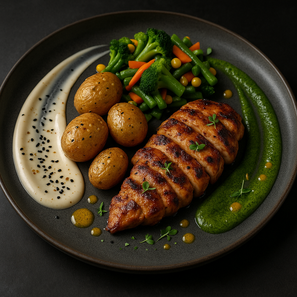
Insight 1: Overlapping food zones (chicken oil under potatoes)
Let’s start with the theory: Cross-Modal Contamination (Spence et al., 2010). When oily grilled chicken leaks into the potatoes, the visual cue becomes unappetizing. The brain predicts mixed, soggy textures and lowered hygiene—even if the taste is good. Clean separation = clean perception.
Real Example: Restaurants like Eleven Madison Park serve protein and carbs in different zones or on layered surfaces to maintain visual hygiene.
Insight 2: No garnish or color contrast
Here comes Visual Salience & Attentional Bias. If everything on the plate is beige or brown, the brain has nothing to lock onto. No red tomato, no green herb = no visual anchor. This reduces memorability and “shareability.”
Real Example: Noma, a world-renowned restaurant, uses microgreens, petals, or sauce splashes to create visual interest and boost recall.
Insight 3: Everything touches the plate edge
Cue Gestalt Principle of Proximity. When food is crammed from edge to edge, the brain can’t separate elements. There’s no breathing room, which reduces elegance and increases the feeling of mass-production.
Real Example: Japanese Kaiseki cuisine often leaves intentional space around each item to promote calm and perceived value.
The Dining Room Drama
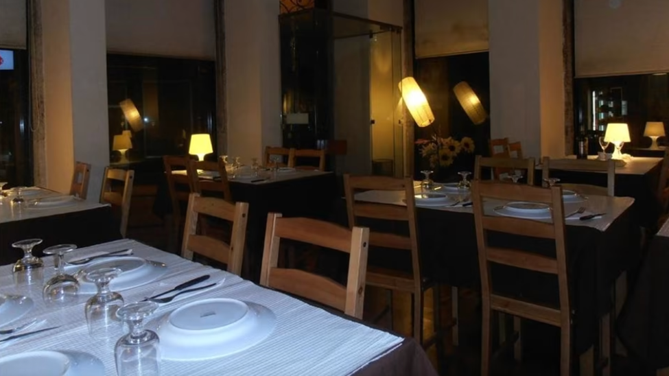
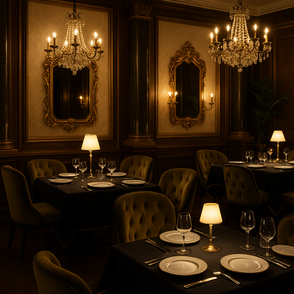
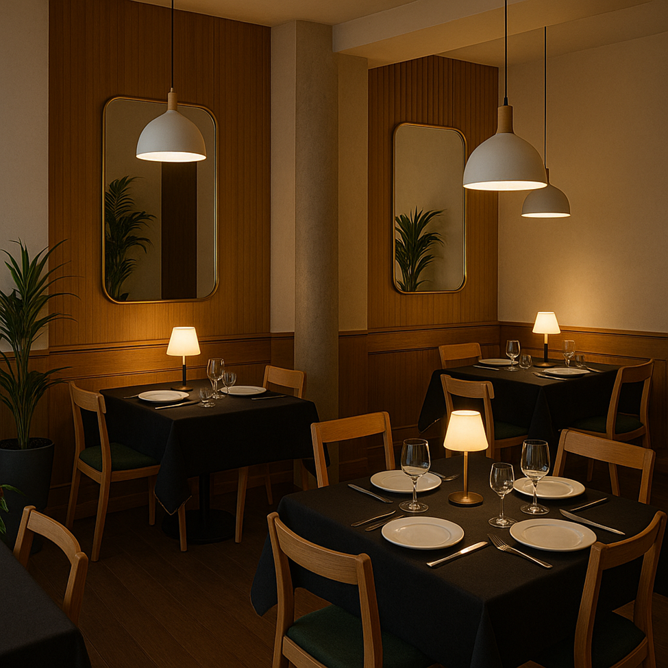
Insight 1: Great table spacing (65–75cm apart)
This is Personal Space Theory (Proxemics – Edward Hall). The brain relaxes when it doesn’t hear the neighboring table’s breakup story. With 70cm spacing, the amygdala calms down. Result? Guests linger longer and spend more.
Insight 2: Unmatched lighting angles and tones
Enter Environmental Incongruence & Cognitive Dissonance. When lighting sources clash—say, a diagonal yellow lamp and a cold overhead light—the brain doesn’t know how to label the mood. It feels less elegant, less coherent.
Real Example: Le Coucou in New York uses consistent warm, downward lighting for cinematic depth and emotional harmony.
Insight 3: no emotional anchor
Let’s revisit Affective Priming. The absence of flowers, colors, or small decor pieces makes the table emotionally flat. The guest’s subconscious doesn’t connect the table with anything memorable or intimate.
Real Example: Dishoom in the UK uses candlelight, vintage frames, or personalized runners to inject emotional meaning and improve recall.
The Menu Trying Its Best
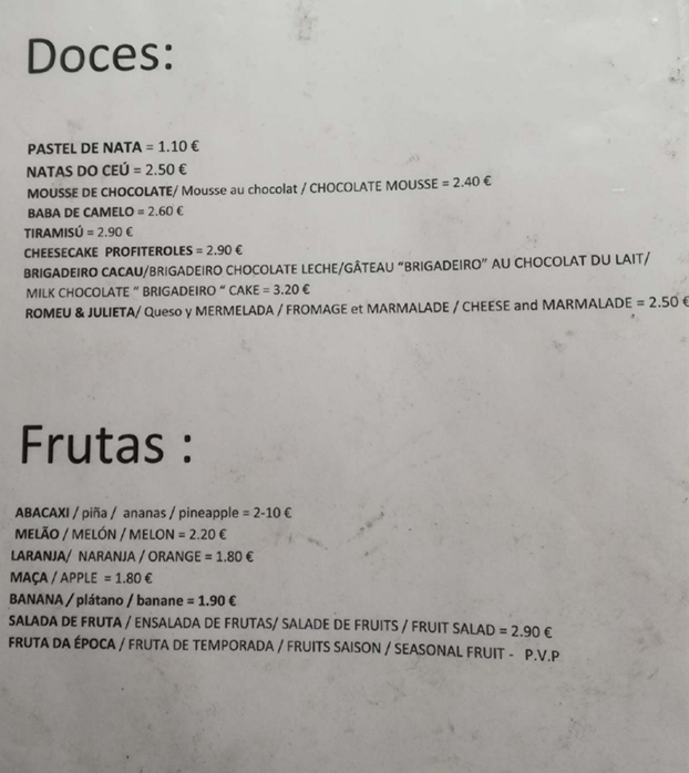
Insight 1: Cross-lingual dish names
We activate Cultural Priming. When a guest sees their native language, trust spikes. Familiarity breeds psychological comfort.
Insight 2: Prices aligned with names using “=”
Welcome Price Salience & Anchoring Bias. The “=” makes the brain focus immediately on cost, triggering logical (System 2) thinking. That’s not what you want when someone’s about to impulsively order chocolate mousse.
Real Example: Premium dessert menus often use spacing, dots, or columns to visually separate name and price, easing decision-making.
Insight 3: No formatting contrast
Our old frenemy Cognitive Load Theory returns. If every item is formatted identically, the brain has to process the whole list manually. This increases mental fatigue and reduces upsell potential.
Real Example: Dominique Ansel Bakery uses icons, typography contrast, and layout hierarchy to guide the eye toward top-margin items.
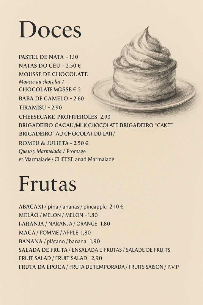
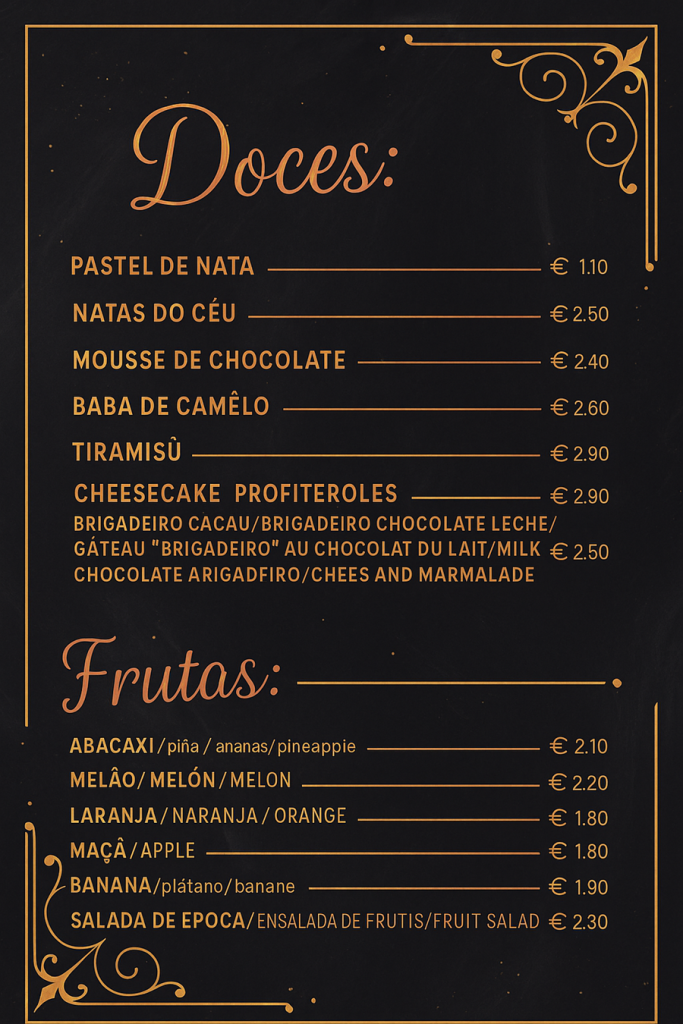
So What Can Be Done? The Under €500 Fix
€80: Buy matte black or dark grey plates and use colorful garnishes (microgreens, pickled radish, dots of beet sauce). Result: boosts memory, perceived hygiene, and makes meals camera-ready.
€250: Add three warm-toned table lamps, four linen table runners in neutral tones, and a few identity anchors (e.g., quote near restroom, branded card at entrance). Result: increases ambiance, reduces stress, improves guest recall.
€150: Redesign dessert menu using tiered pricing (€1.90, €2.90, €3.90) and highlight two high-margin items with icons or gold framing. Add brief emotional copy (“Chef’s Favorite”). Result: higher dessert sales, lower decision fatigue.
Total: €480.
Estimated ROI? €1.80 more per guest per visit + increased social media tagging + higher TripAdvisor/Google reviews.
In Conclusion: Pretty Tables Are Nice — But Predictable Brains Pay More
This restaurant isn’t broken. It’s just… unoptimized. A few tweaks could dramatically shift how guests feel, behave, and spend — without changing the food.
And remember: your customers won’t say “The cross-modal contamination of my chicken juices ruined my experience.” But their brains already did.
This breakdown? It’s just how my own brain interpreted some photos and patterns. You can disagree (and the world would still spin), but behavior doesn’t lie.
Oh — and those images? They’re just stylized visualizations of what could be going on. But the neuroscience behind it? Solid. 😉
No responses yet